Ok, maybe not Picasso, but data visualisation allows us to see data in a way that generates an impact. While it’s unlikely we’ll be showcasing our work in a gallery any time soon, it’s an interesting journey to see the story data tells us.
There are plenty of Ted Talks discussing how visualisation puts an element of reality towards data collected.
Take David McCandless’ address at TedGlobal in 2010:
“Visualising information so we can see the patterns and connections that matter and then designing that information so that it makes sense, where it tells a story, or allows us to focus on information that’s important.”
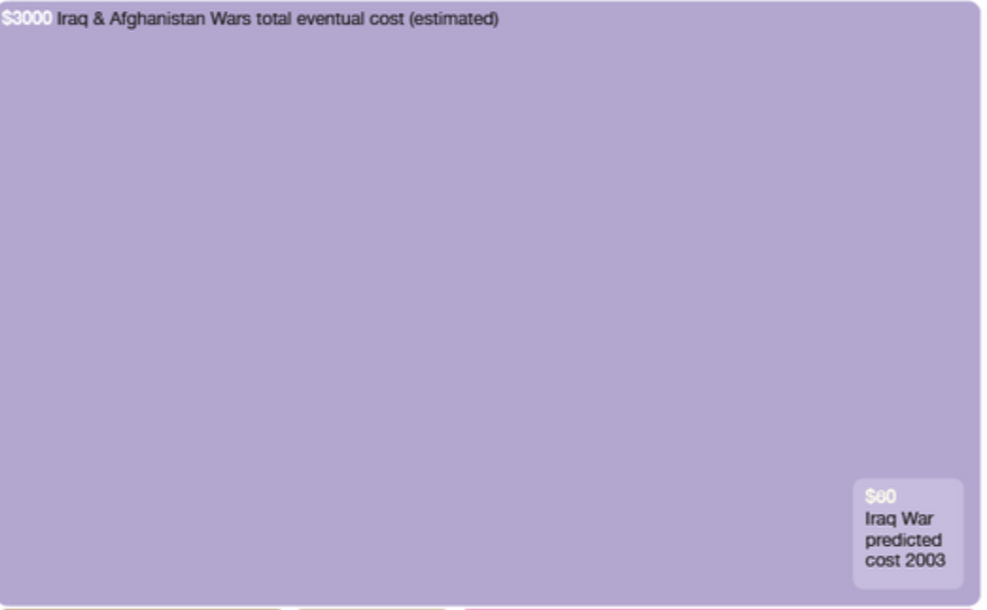
Have a look at the billion dollar-o-gram for instance. This image put several subjects we’ve all heard about, seen in the news or even perhaps experienced ourselves into a visual representation. It was created after the copious amount of headlines discussing billion dollar spending. Individually the headlines begin to mean little, with the word ‘billion’ becoming white noise after hearing it so often.
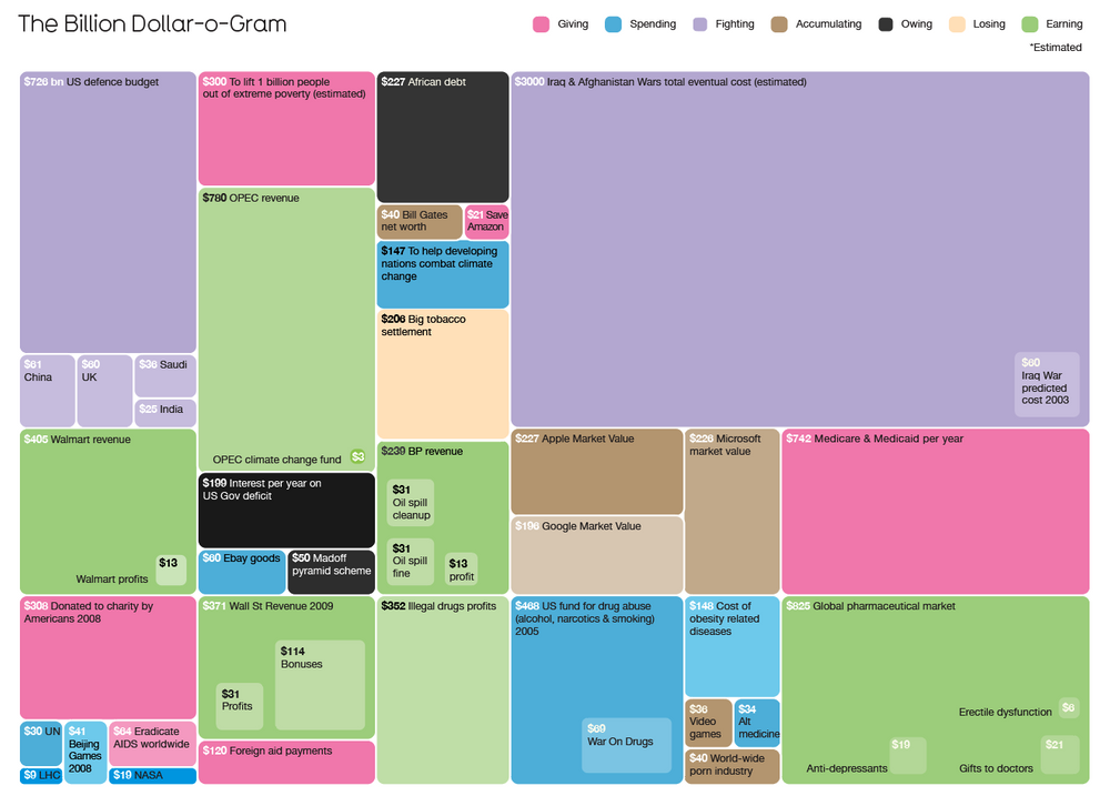
It talks about things like the cost of the Iraq/Iran war. What was budgeted to actual spend. Both headlines talk about the billions of dollars, but the impact doesn’t come until the scope is translated into a visual impact.
Data visualisation ins’t just about understanding a situation, but it gives us an opportunity to learn. When you can visually understand a process in which something is completed it makes it much easier to identify areas that were successful and learn what areas need improvement.
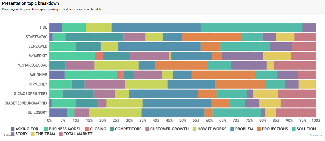
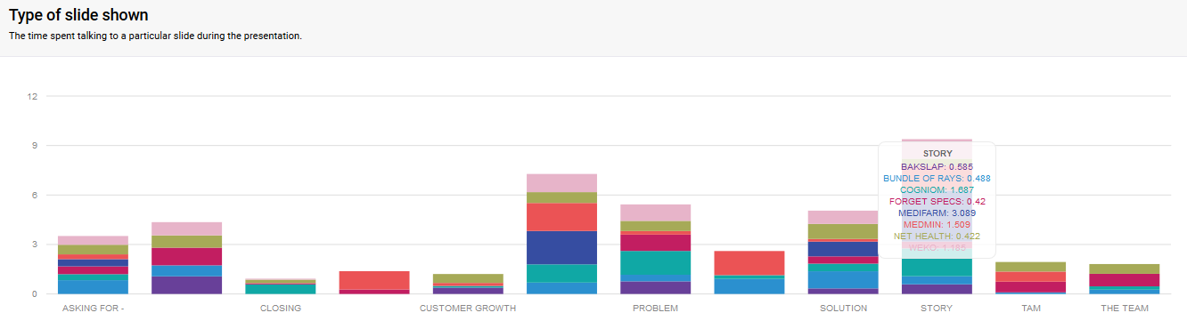
Enter: The Pitch Presentation TANDM Study.
To cut a long story short we learn that pitches require certain topics to be covered in a per-determined time frame. In a successful pitch, the presenter takes the audience on a journey along a clear and concise path, at the end of which the audience understands the story and is left with a feeling of satisfaction of a great presentation.
Now, for those of you who have been following the Cogniom journey from the beginning and have seen the transformation of our pitches, you’ll have an idea of the hard work that has gone into them.
And while we’re on the subject, let’s just take a moment to shout out to Robert Buehrig on his pitching successes!
(speaking of, you can check out Cogniom’s latest pitch here!)
So how was it achieved? Data Visualisation.
While we were working on the very product we were pitching to audiences, we started to use the TANDM Suite during its trial phases to assist us with our pitch presentation. We created a study to measure the length of the presentation, the amount of time spent on each topic, the use of the stage area and how many slides were used.
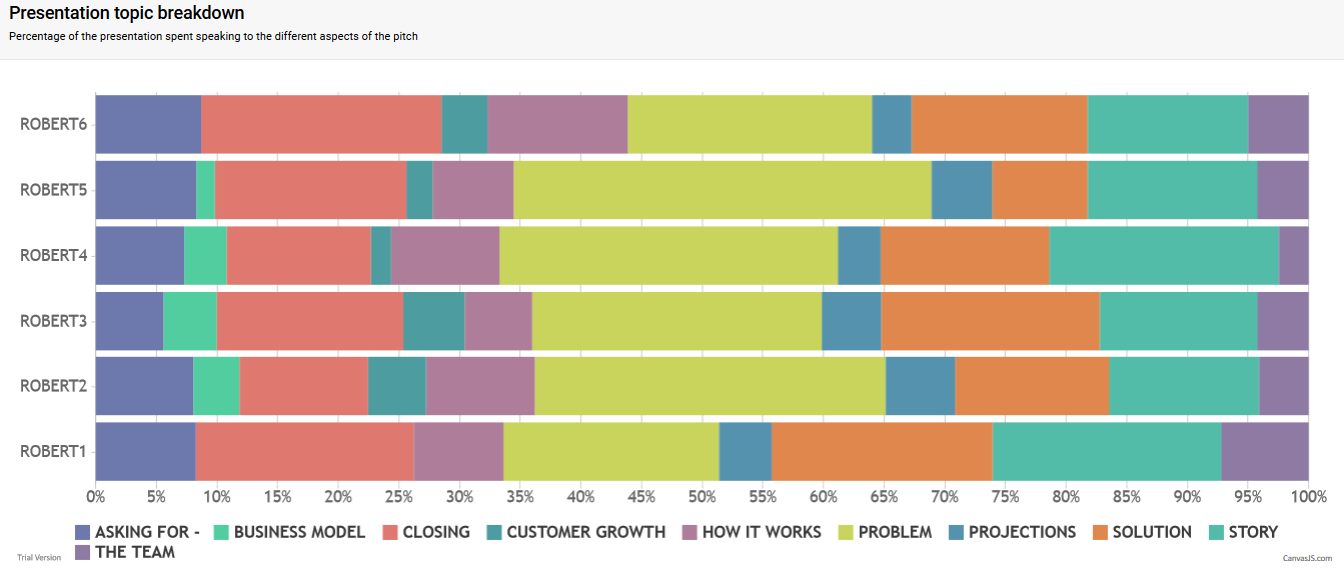
Using the data recorded from the TANDM study we were able to determine the areas that needed improvement and continued working and studying the pitch performance until it became a well-oiled machine. We expanded our research to include the application of the study to successful pitches (eg: resulting in securing investing / generating revenue) to allow a benchmark to be set.
We’ve also been able to take the study on the road, attending various pitch events across Brisbane and the Sunshine Coast helping other start-ups and entrepreneurs understand their own pitching patterns.
The fun part has been our ability to use the data collected during a pitch event to predict who the winners are likely to be.
So far Cogniom is 4-0.
When you introduce the impact of changing data from numbers to a visual representation it creates the opportunity for a higher level of understanding of the problem or situation being looked at.
Collecting data is no longer just about a series of numbers. Data is a story. It takes us on a journey to find truths and possibilities for learning.
And just like art, it’s really cool to look at.